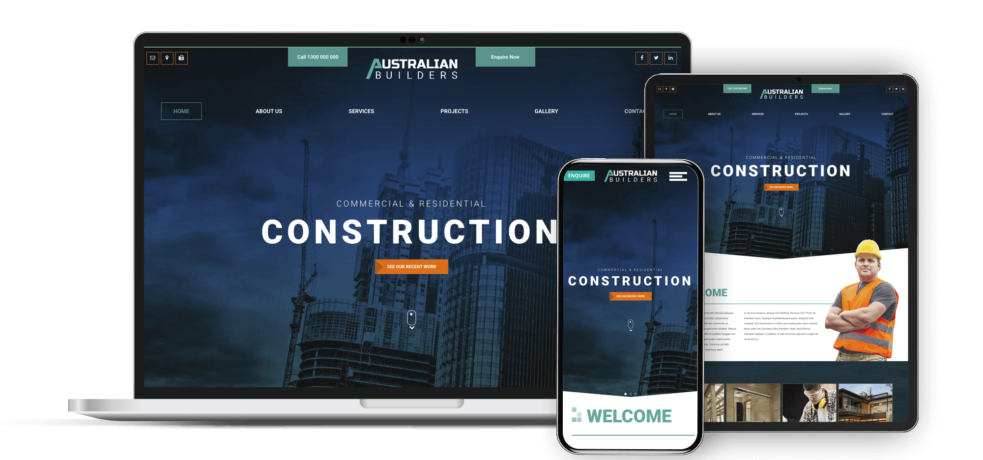
Responsive Website Design: Crafting sites that adapt to any screen
Web pages that work beautifully on every device
Your web page is often the first impression people have of your business. And in a world where more than 60% of users are browsing on mobile, it's critical that your site looks great and just works - no matter what kind of device it's viewed on.
Responsive web design is a must for today's online world. At Havealook, we craft websites that perform well no matter the device: phone, tablet, laptop, or desktop. And whether you're a small operation or a growing online service, we make sure your site is not just accessible but also engaging. That's because common sense and experience tell us that a site lacking these essential ingredients is just an online brochure, when what you really want is a web presence that converts browsers to customers.
What Is a Responsive Website?
A website that is responsive has a layout that adjusts automatically to the size and shape of the screen it is viewed on. These sites are built with flexible grids, scalable images, and adaptable coding that provides a friendly and straightforward interface, regardless of the device's dimensions.
We design mobile and dekstop versions at the same time as part of our design strategy to producing all our websites. After choosing a suitable combination of looks and functions, we see how the site has been optimised for the mobile user. And then, scale it to ipads and tablets with medium sized screens.
Why Responsive Design Matters. Web Browsing on a Mobile Device Is Commonplace
More individuals browse the web using mobile devices today than use desktop computers. If more people are using mobile devices to browse the web, then your website absolutely must be optimised for these devices. And according to Google, if your site is not optimised for mobile, then 5 times as many people will leave your site compared to those who will leave if your site is optimised for their browsing form factor. With custom-made responsive sites from Havealook, your business can achieve a continuity of experience - no matter how or where your users are accessing it.
Responsive websites canenhance Your SEO Rankings
Ever since Google adopted mobile-first indexing, responsive design has become a primary SEO ranking factor. This means that a site that works well on mobile devices - such as smartphones and tablets - has a much better chance of ranking higher in search engine results and pulling in more organic traffic.
We craft websites that are both user-friendly and search engine-friendly, resulting in an optimum balance between the two that is rare in today's web world.
Websites from $995
Manging your website is simpler
When you have a single responsive site, you do not need to maintain separate versions for desktop and mobile. You update your content once, and it works everywhere - saving you time and reducing the risk of errors.
Responsive sites with a built in CMS make long-term management easy. They are built to be easily updated and maintained.
What’s Included in a Havealook Responsive Website?
Each responsive site that we construct possesses the following attributes:
- Cross-device mobile-first responsive design that works on touch and with every type of menu and buttons
- Browser compatibility testing
- Image and layout scaling that works
- Integrated SEO structure
If you need to sell online, we can also construct a responsive e-commerce website that looks great and performs well on any screen

Speak directly with our designers when building your website.

Right here in Australia, on the phone or by email we are here to help.

Want to update your own website? All our websites come with an easy to manage portal.