


As businesses, having a website is the first stepping stone to digital success, but the reflection it has on your business is even more important. If you’ve been long avoiding that much-needed refresh, you’re likely losing out on the opportunities a good website design could be opening up for your brand – from better brand perception through to customer loyalty and retention.
So what kind of effect does a good website design have on your bottom line, and what’s it saying about who you are as a brand?
Beyond everything, it lets the world know you’re serious
If you were a major brand running off a stock-standard WordPress domain name and a templated layout, chances are you wouldn’t be taken all that seriously by visitors. In a world where security is all the more important online, representing your business as something that’s trustworthy, authentic and serious about its line of work, is key. As a consumer, you wouldn’t invest in a brand that didn’t put effort into how it looks, so why would you do the same if their website was far from up-to-scratch?
First impressions still matter
How you choose to integrate elements of your website into the visual space and the psychology of it all has a profound impact on the kind of impression you’re giving your customers. Those visiting your website for the first time are more likely to judge quickly, and if they’re not enticed at the click of your fingers, you’ve most likely already lost them.
It takes users an average of online 0.05 seconds to form an opinion of whether a site deserves their attention or not. In that flash of a heartbeat, they’ve already decided whether they’ll stay or leave, and probably if they’ll ever choose to return or not. While the whole “don’t judge a book by its cover” mentality is still real enough in the business landscape, it’s not so much a viable option for the online world – you’ve got a few seconds to garner that perfect first impression, and then make it stick.
So why exactly are consumers so judgemental and demanding?
Thanks to the instant offering of the digital ecosystem, users have become more and more impatient with pinning down the answers they’re after or finding sites that hold their attention long enough. No longer can brands afford to push marketing messages out there and demand to be listened to – these days, users are the ones who sit behind the steering wheel, so they’re given free rein on who they stop to pay attention to, and who are just wasting their time.
What this means is that for businesses across all industries, creating the perfect first impression is paramount. A balance of psychology, strategic web design and conversion optimisation crafts a user experience that ends up reeling those users in, rather than setting them free to roam competitor websites.
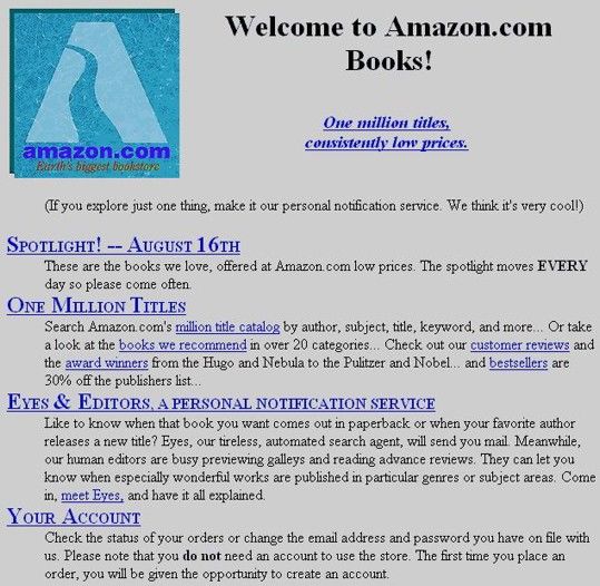
Would you think of Amazon.com the same if it still looked like this?
If your platform lacks these particular features, it’s likely you’re not collecting page views or clicks at all, or at the very least, your bounce rates are skyrocketing through the roof.
What forms a good first impression?
The art of a hard-hitting website design comes down to the combination of the aspects we mentioned above, but also takes a professional insight and knowledge pool to weave them all together. It’s not enough to throw them into an arrangement and hope for the best – strategic placement is critical, and while user behaviour continues to fluctuate online, so too do the responsibilities of website design.
So what exactly forms the right kind of balance? In a sleek, well-performing layout, you can expect to see some (or all) of the following features:
- A hero image or banner graphic that grabs attention quickly;
- Branding or logo that’s consistent and up-to-date;
- An easily identifiable navigation bar to see what’s included on the site;
- Headings and large text that states primary messages;
- Contact details and call to actions that can be accessed quickly.
- A mobile-responsive design that allows for cross-platform viewing.
You are what you portray
When you stand in front of the mirror, you’re likely to judge certain bits and pieces of your appearance. You wouldn’t head into a hugely crucial corporate meeting looking unkempt, so why would you let your website? Unfortunately, in the digital world, many businesses still lack the self-reflection to assess how they’re coming across to primary audiences.
Just as first impressions are vital for online success, so are the visual aspects of the website itself. While your design and layout may be sleek, visually enticing and able to reel in attention, all of the images and graphics still need to remain on-brand and relevant to who you are as a business.
If you’re an accountant who specialises in small business relations, you wouldn’t display images of someone running in activewear, or kids laughing in a playground. The visuals you choose to include on your site should say something about who you are as a business – users should be able to take one quick glance at your images and know exactly what you’re all about. In a world where snap judgements are the essence of conversions, this is critical.
You’re inadvertently displaying your business values
Whether you actually give it much thought or not, your website design determines what your business values are from the outset. From the hierarchy of information on your website, through to the structure you’ve opted for – how you’ve gone about your layout says mountains about your brand. A good design will take advantage of this, displaying critical information, key messages and high-converting elements in all the right places.
When taking all of this into consideration, there are a few rules to keep in mind:
- The most important thing you have to say on behalf of your business should be included in a robust and unusual image or attention-grabbing text block. In some cases, a video may work better to entice users to engage, or the use of colour psychology may be required to hit the nail on the head.
- Supporting content should sit under your main message, allowing users who perhaps didn’t pay enough attention to the first element to then be reinforced here. This usually comes down to secondary text or an invitation to scroll on – the trick here is to keep it simple.
- A call to action should be visible at all times. No matter the stage of the user journey and sales funnel your visitors are in, they should be subtly encouraged to take action. This usually means incorporating conversion optimisation to include all the right colours, buttons and engaging elements to make an impact.
You’re giving an insight into your branding
Think of a website as a public stage to your business; anyone who chooses to land on your page (and spend more than the 0.05 seconds on it) can learn all about what you do, who you are and what you can offer them. As your website paints a powerful picture of your brand, controlling this perception comes down to consistent, attractive branding.

Our recent client – 24-7 Fitness – incorporates branding seamlessly into their website.
Well-thought-out website designs incorporate all of this information neatly, allowing a brand story to be told without clutter and distraction for the user. While you can’t always control the information that’s available online about your business, you can utilise your website as a portal to maintain brand reputation and perception.
So how do you use branding to entice your audience?
Think about the physical branding you already have in use. From in-store signage, printed collateral and business cards – tying all of these aspects into your website design connect the dots for users who may not be familiar with your brand in its entirety. Beyond that, all of these elements further contribute to defining the personality of your presence – are you fun, serious or something a little outside-the-box? How do you want to come off to your target audience?
Mirror, mirror, on the wall
Take a step back and look at your website objectively. If you were a user sitting in the colder areas of your sales funnel, how would you interpret your brand, based on the first impression your website delivers?
Now recall the 0.05 seconds you have to play with, to grab user attention. How are you contributing to their perception?
If you feel your website could use a splash of fresh paint or assistance with conversion, our experts are on hand to help you action all the right steps. To find out more, get in touch by contacting us on 1300 367 009 – we can help you discover how a good website design paints a thousand (positive) words for your brand, opening new doors to opportunity and success.