


Lately, the online space has been dominated by the ‘what ifs’ of Google’s growing interest in mobile-first search. And for good reason. The search giant has long been trying to turn a new leaf over from the emphasis placed on web browser-driven content and websites.
Now, it’s looking to shift its focus to reflect user behaviour trends. As we continue to consume content on-the-go, our reliance on cross-device support means it's increasing. So it comes as no surprise that Google is keen to get the ball rolling on embracing this demand, allowing its users to explore and navigate the web in a more mobile-friendly way.
What is mobile-first indexing?
While talking about SEO can be a long and winding road, the complexity of mobile-first indexing isn’t all that complicated in essence. In a nutshell, Google is looking to prioritise mobile versions of a website over a desktop one. That means if you do have mobile website that’s up and running, the search giant will prioritise its content over anything else. If you don’t have one, your rankings may find themselves in jeopardy, as competitors with a mobile site that’s filled with up-to-date content may be favoured.
But to understand how important this all is to your website strategy, it’s worth getting your head around what an index actually is. In its simplest terms, an index is just a huge database of URLs that Google scrapes, collects and stores across the web. This is done by the search engine’s nifty little ‘spiders’ or ‘crawlers’, which scan each page to then be returned when a user submits a search query.
Up until now, this database has been a structured list of organised URLs, which all help to determine Google’s search result rankings. But these days, information across the web can be found in all sorts of content formats – from video, through to apps images and multimedia. This means that the foundation of traditional indexing doesn’t quite support the evolution of media types across the web anymore, thanks to the rapid speed of technology. As a result, Google’s pumping out its mobile-first indexing changes to better reflect the nature of the online landscape and the way users consume content.
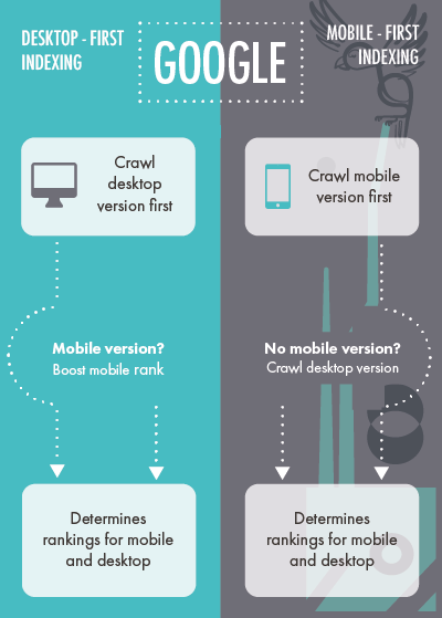
While it’s still not 100% clear how much this new approach will shift the waters, it is understood that it will require a new way of thinking from business owners, webmasters and SEO technicians. While traditional indexing considered desktop versions as the priority, mobile-first indexing will mean Google’s bots look at mobile websites first. If there is no mobile version to crawl through, the desktop version will be the next in line. In the end, your rankings will be a reflection of just how mobile-friendly your website is (if at all).
Taking action: what should you do?
Right now, there’s no immediate need to panic. While Google’s changes often get us all up in arms over what to change first, the giant is still in the initial phases of developing mobile-first indexing. As of earlier this week, webmasters across the globe are slowly being notified of their websites being enabled for mobile-first notifications. But these websites are currently those that the search engine deems “ready enough” to be included in the testing phase. That means you still have time to sit back, put your feet up, and consider how to ensure your site’s optimised and ready as the update rolls out.
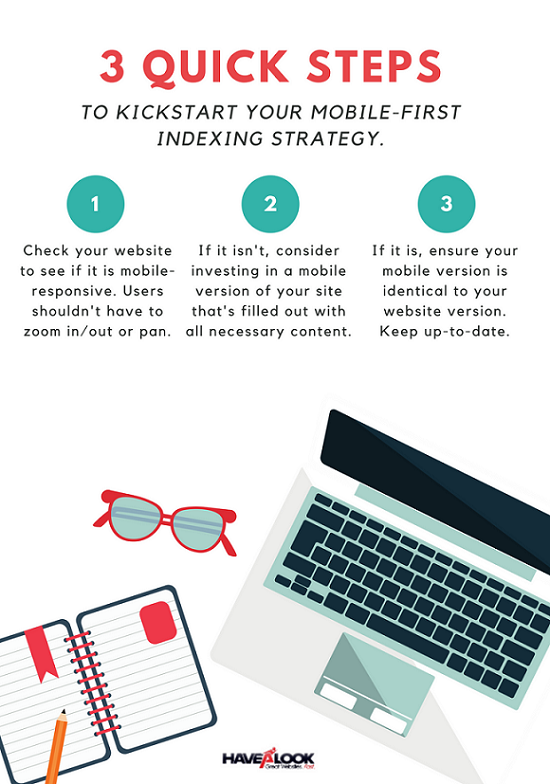
Luckily, there’s a few basic steps that you can jump onto, without having to be a ‘tech guru’, and a good website designer can also help you to fill the gaps.
Get responsive
Having a mobile-responsive website has been a critical part of the ranking process for a number of years now, but mobile-first indexing means that this is more important than ever been before. This means having a site that’s designed with easy navigation and on-the-go reading in mind; users who are browsing on a mobile device shouldn’t have to worry about zooming in, panning or endlessly scrolling – a responsive website will do all of this automatically. If you don’t have a mobile-responsive website yet, it’s time to consider getting one, as Google shifts its preferences to those that have adopted these designs.
Update your content
It’s important to note that your desktop website won’t become redundant – it will just become the secondary determinator of your rankings. But if you have both a desktop and a mobile website, yet your mobile-responsive one is simply a placeholder, this won’t quite make the cut either. As Google has always placed a heavy emphasis on quality, filling out your mobile website with just as much top-notch content and information is absolutely vital. Put simply, your desktop and mobile websites should be identical, with the same amount of TLC poured into both.
Check page speed and load times
There’s nothing worse than waiting of a page to load (think dial-up days), and Google hates it even more than we do. In the age of mobile-first indexing, page load speeds will become even more crucial to the ranking process, so it should be on your to-do list to make sure each page on your website is optimised for best possible outcomes. That means ensuring all images are mobile-friendly and that content will positively contribute to the user experience, not hinder it.
...or do nothing
If you’ve got the urge to throw it all in the ‘too hard’ basket, we encourage you to think again. Investing all that hard work into your desktop site shouldn’t be thrown to the wind. Instead, use it as a model to revamp your mobile site and ensure you’ve got both versions as optimised as possible.
And if you’re not looking to jump on the mobile bandwagon just yet, it’s likely you will miss out on integral opportunities to rise above competitors who may be thinking along the same lines.
Get ahead: kickstart your mobile-first strategy
Google’s determination to user behaviour is an unwavering one. Ignoring the need for a mobile-first web strategy means you’ll quickly fall behind when attention is needed most. But for those looking for opportunity, investing in a mobile-responsive website could end up being the make or break of your rankings results in the long-run. Close off the avenues for competitors to get ahead by making sure you’re ready for the mobile-first indexing rollout.
So the next time you have a look at your web design on your mobile phone, or tablet be sure to check if all elements are loading correctly and neatly in ample time. Also make sure that your mobile web design does not look too different to your desktop version, the whole point is that it is responsive, not different.
Not sure how to get started? Contact a Havealook strategist on 1300 367 009.